
The 2019 Fall Color Palette
Twice a year I get super excited about color….Spring and FALL!
Spring because I am a flower lover and everything is so fresh and in bloom.
But, Fall, well maybe it is because I am an October birthday. Maybe it is because I consider myself an earth tone, fashionably gravitating toward all those earthy colors all year round.
This year the Fall color trend is for deeper and softer color, creating a more zen space to counter our crazy lives.
Below are the colors I am loving right now and easy ways to incorporate them into your existing decor.

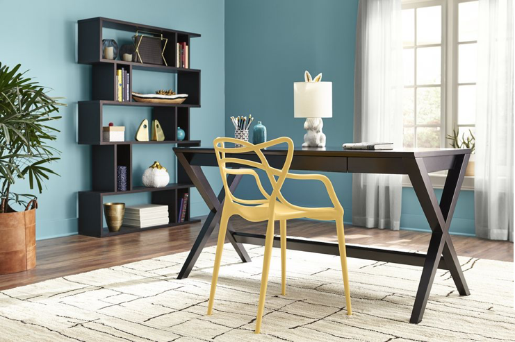
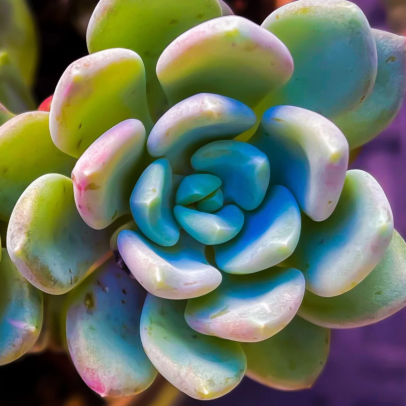
According to elledecor.com, green shades such as Dried Herb and Dessert Sage are serene and blend well with different styles. You can pair it with neutrals or add a pop of color like Biscay Bay to energize the space.
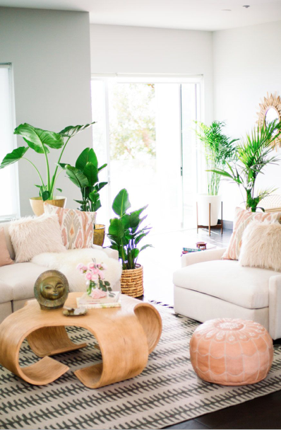
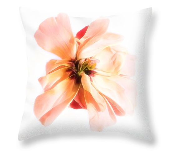
Cadmium Orange is a derivation of the 2019 Pantone color of the year, Living Coral. Pair it with Cashmere Rose and the mood in the room instantly becomes uplifting.
More saturated and moody dark grey hues like Stormy Weather are prefect for kitchen cabinets and built-ins and are perfect in room filled with natural light.
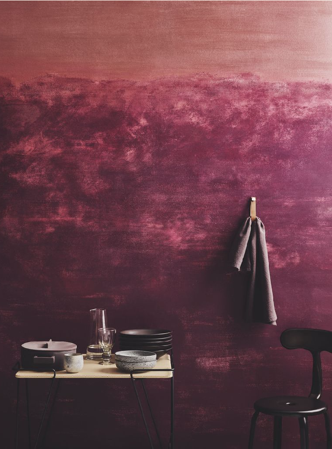
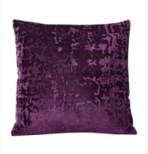
Our technology driven society is now being reflected in the colors of the season. Colors like Amethyst Orchid mimic the edge of light and comfortable familiar.
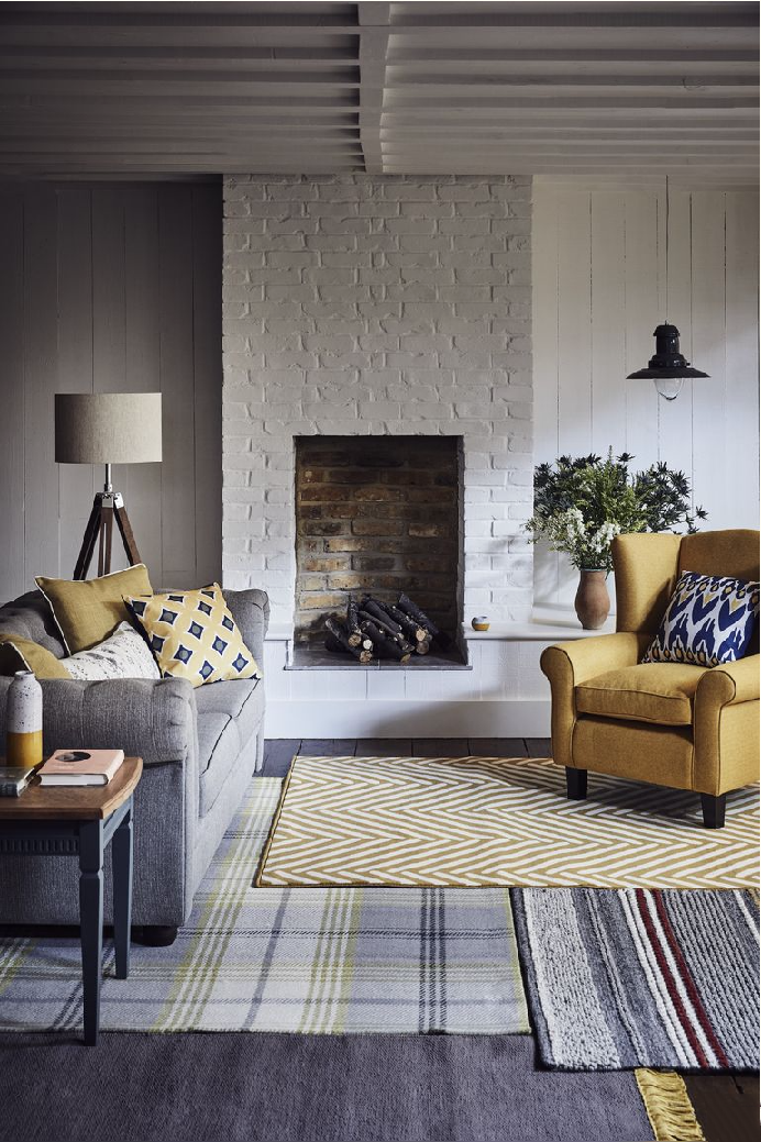
2019 is also the year of optimism and yellows, such as Oak Bluff paired with blues, beiges and pinks (think Cashmere Rose) express our abundance of thankfulness.


I would love to see how you've added the Fall color trends to your home decor if you use my suggestions or products. Snap a pic and send it to me and you might just end up on my website!!
Be the first with all the JKM Fine Art Photography news by signing up for my newsletter.
Shop The Looks


My 2023 Vision Board